A day at the Bee House
/The Bee House at 140 Eastern Avenue, Milton Park recently celebrated its first birthday. As frequent visitors to the Bee House, it has been gratifying to witness its success in its first year, far exceeding targets and expectations
But, what’s it like to actually work there? Project Architect for the Bee House, SRA’s Suzanne O’Donovan (SO) went along to spend a day at the Bee House, meeting up with Queen Bee, Nikki Gibson (NG) from Property Management company Ashdown Phillips & Partners who has been involved from the start to talk all things Bee House.
What was your favourite bit of the development?
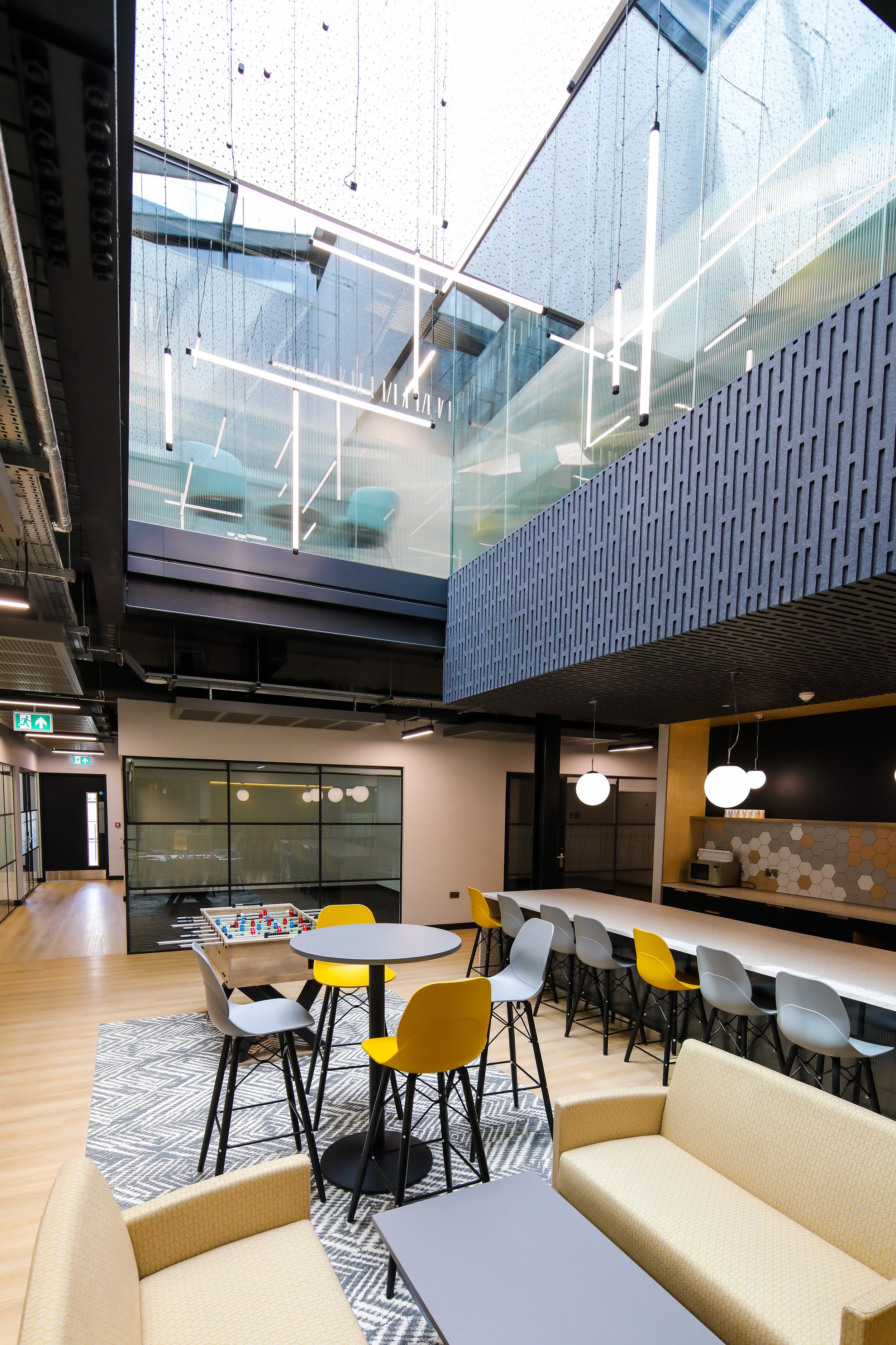
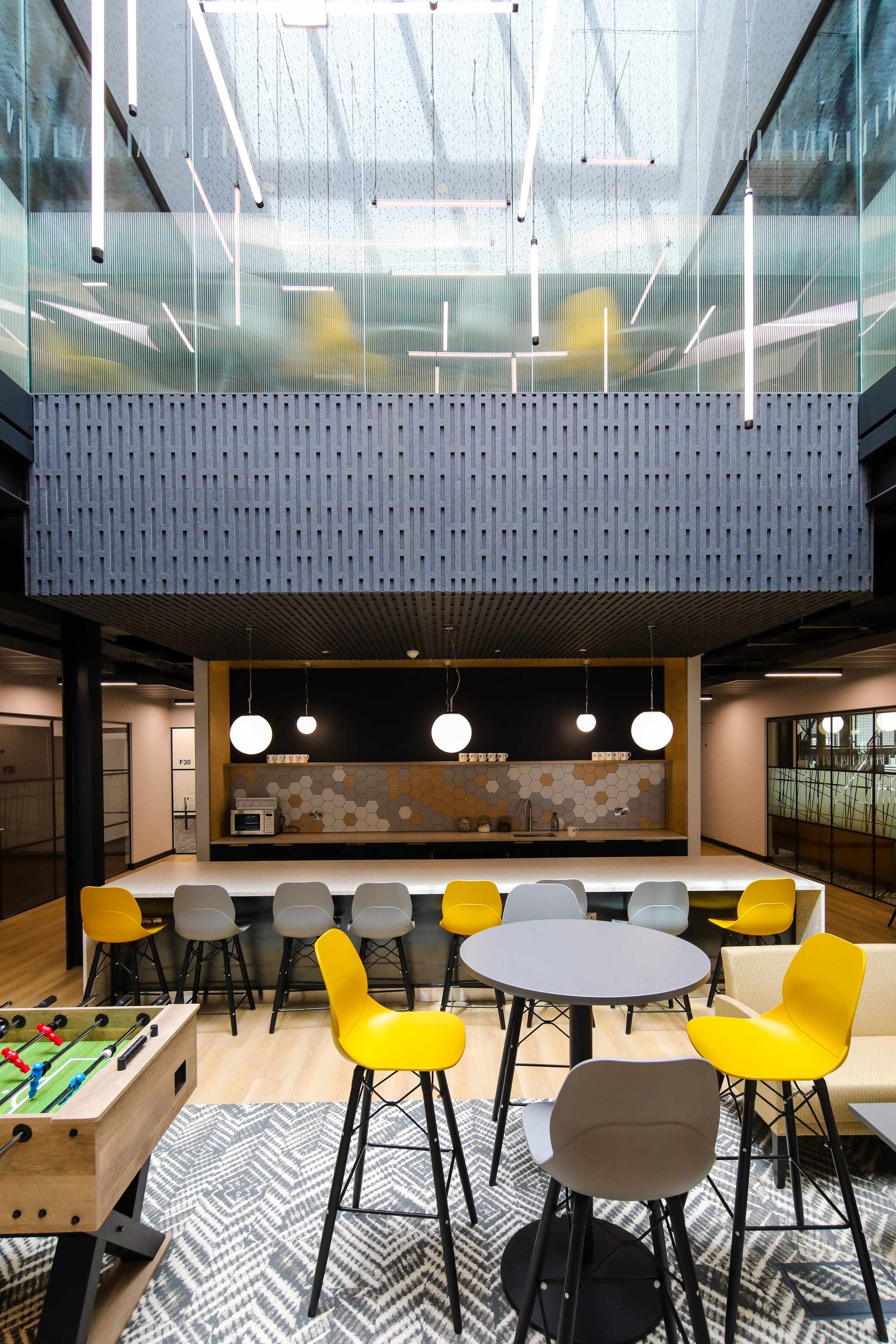
NG: I love the lightwells that were punched through. that's the best feature for me. It makes two, well actually four, beautiful kitchenette breakout areas right in the centre of the building. The ones on the first floor are quite large, they really allow you to get a great sense of community. Everybody's coming out of their offices to these central points. I just love it.
(Photos: Aurelien Langlais, courtesy of MEPC)
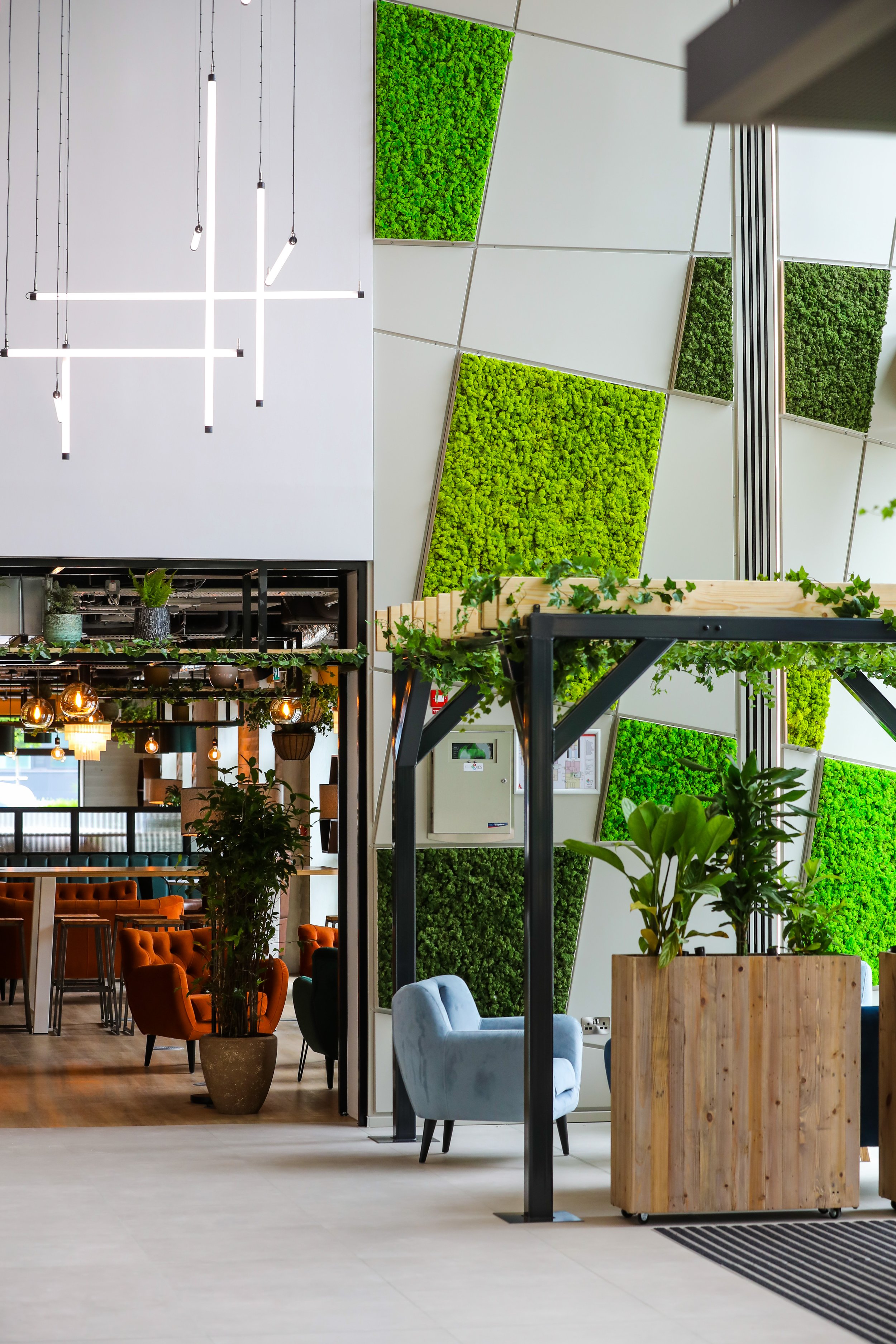
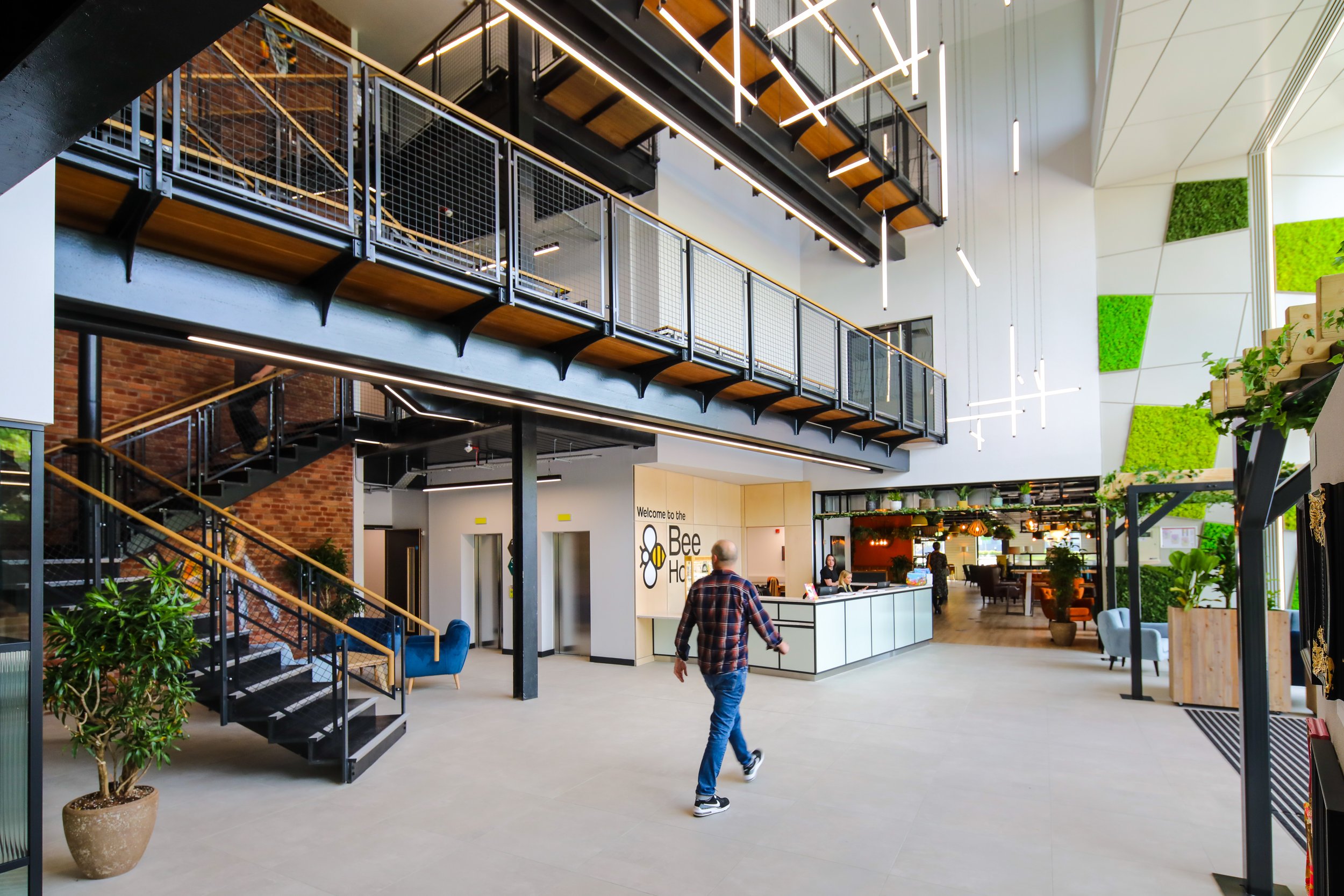
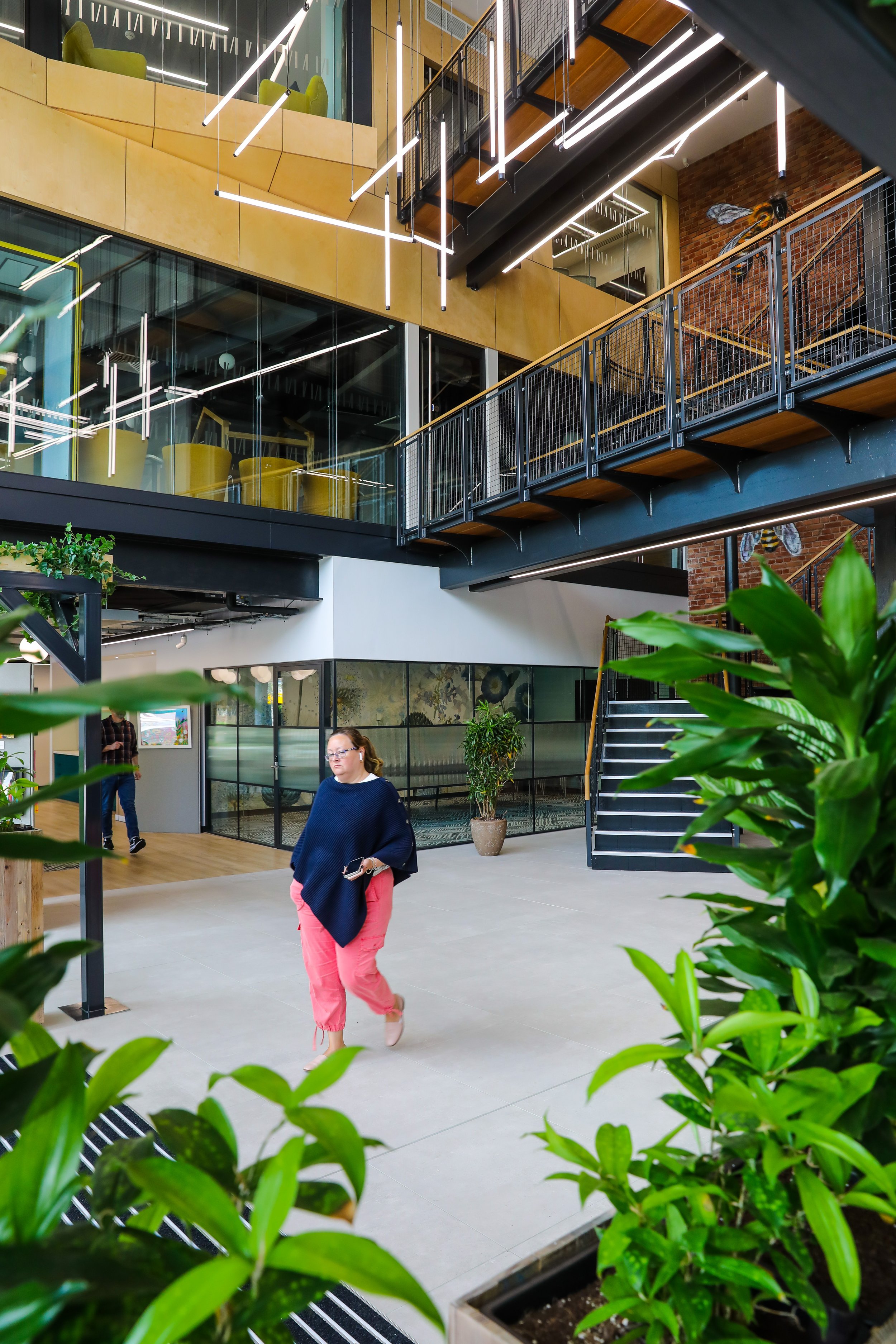
SO: For me, it’s either the lightwells or the atrium. The atrium because – when I think of what had been there before – it was so underwhelming. Even though it was a triple height space, and had the exposed structure of the original feature stairs and bridge, there was just no room. It felt dark and cramped. All we have really done is to add a modest extension, just to give it a little bit more breathing space. The proportions feel right now.
We refurbished the stairs and bridge – they were one of the best features in the existing building. But now it meant that there was space for a large reception desk, space to walk in and look around, look up and space for flow between the café and business lounge.
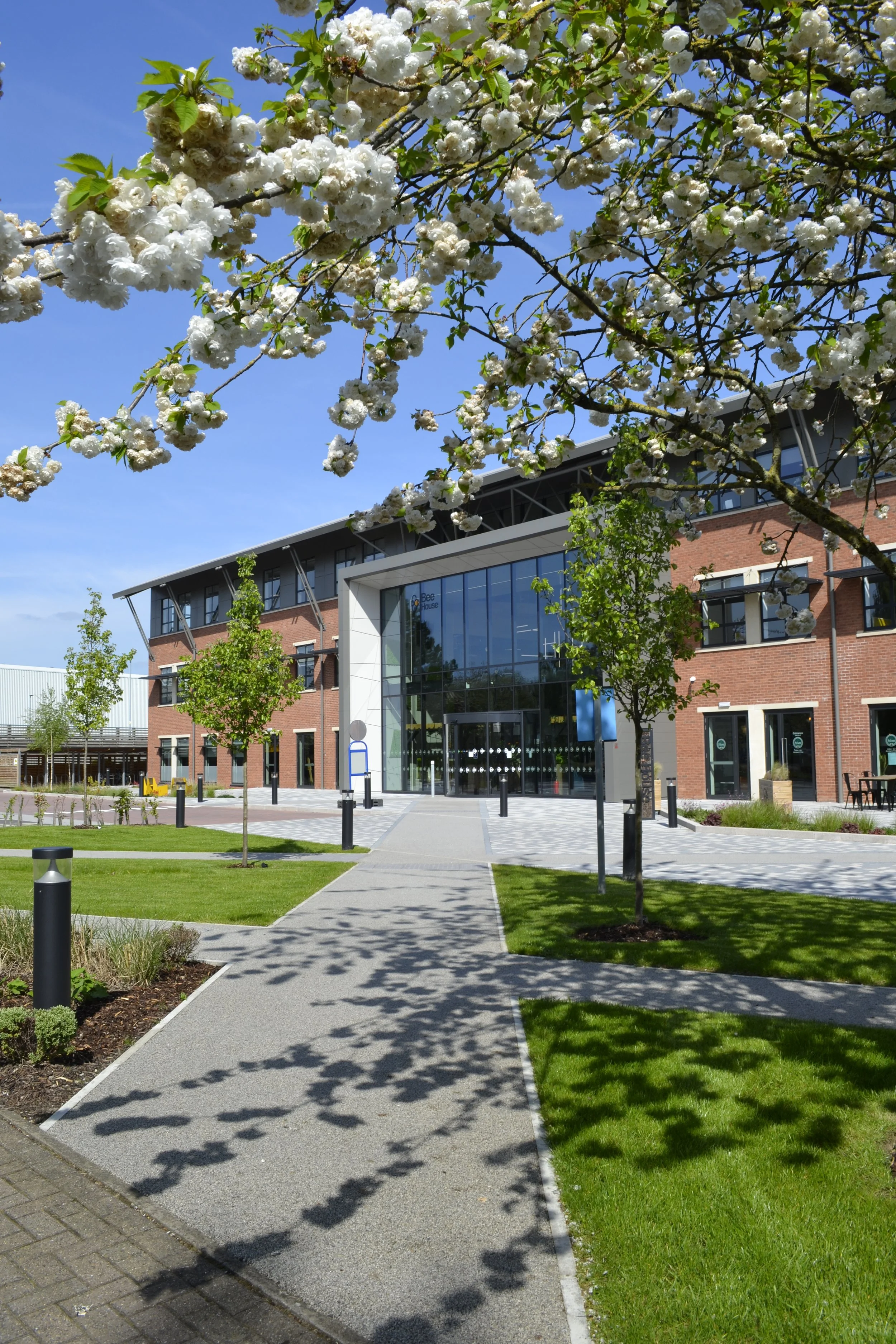
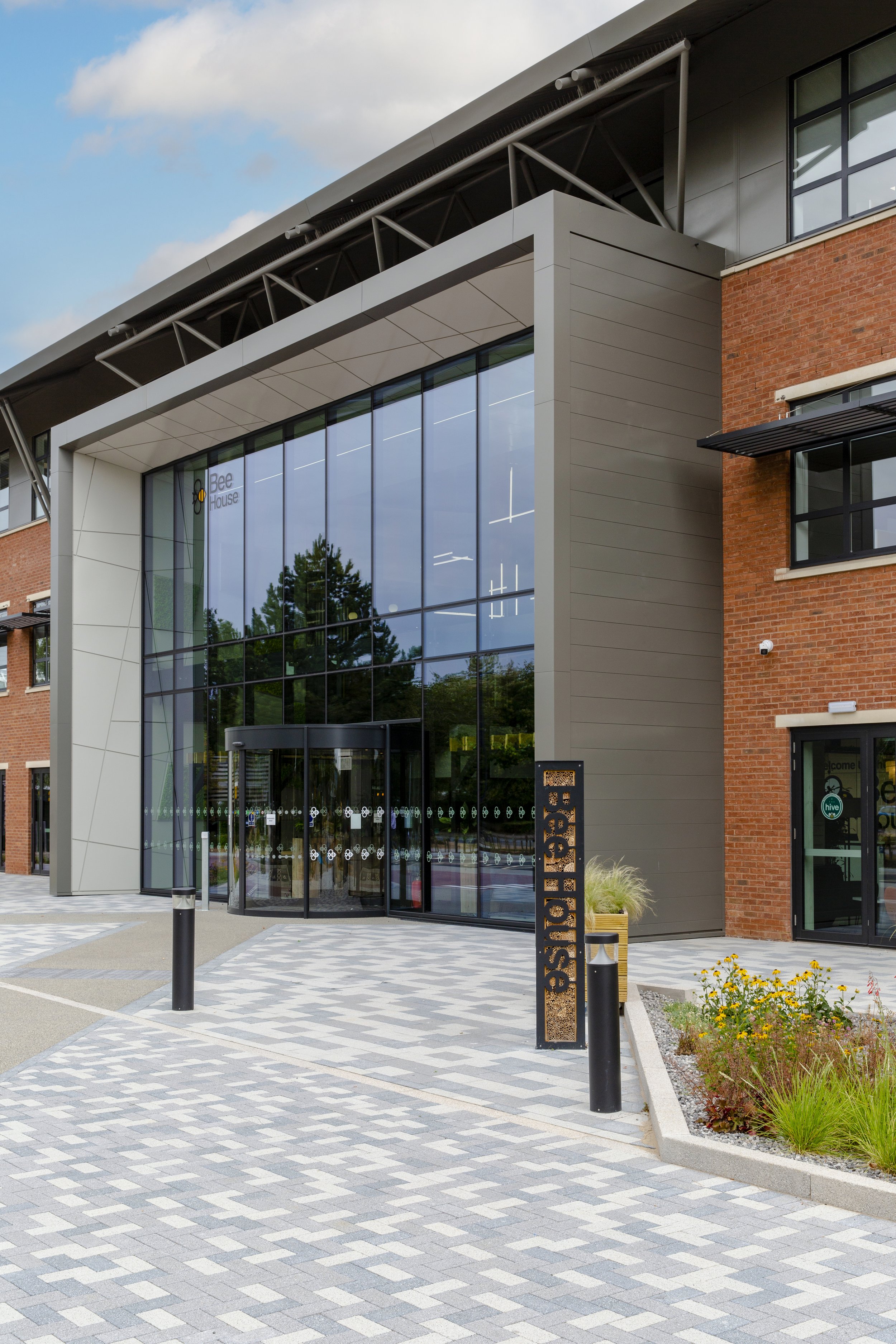
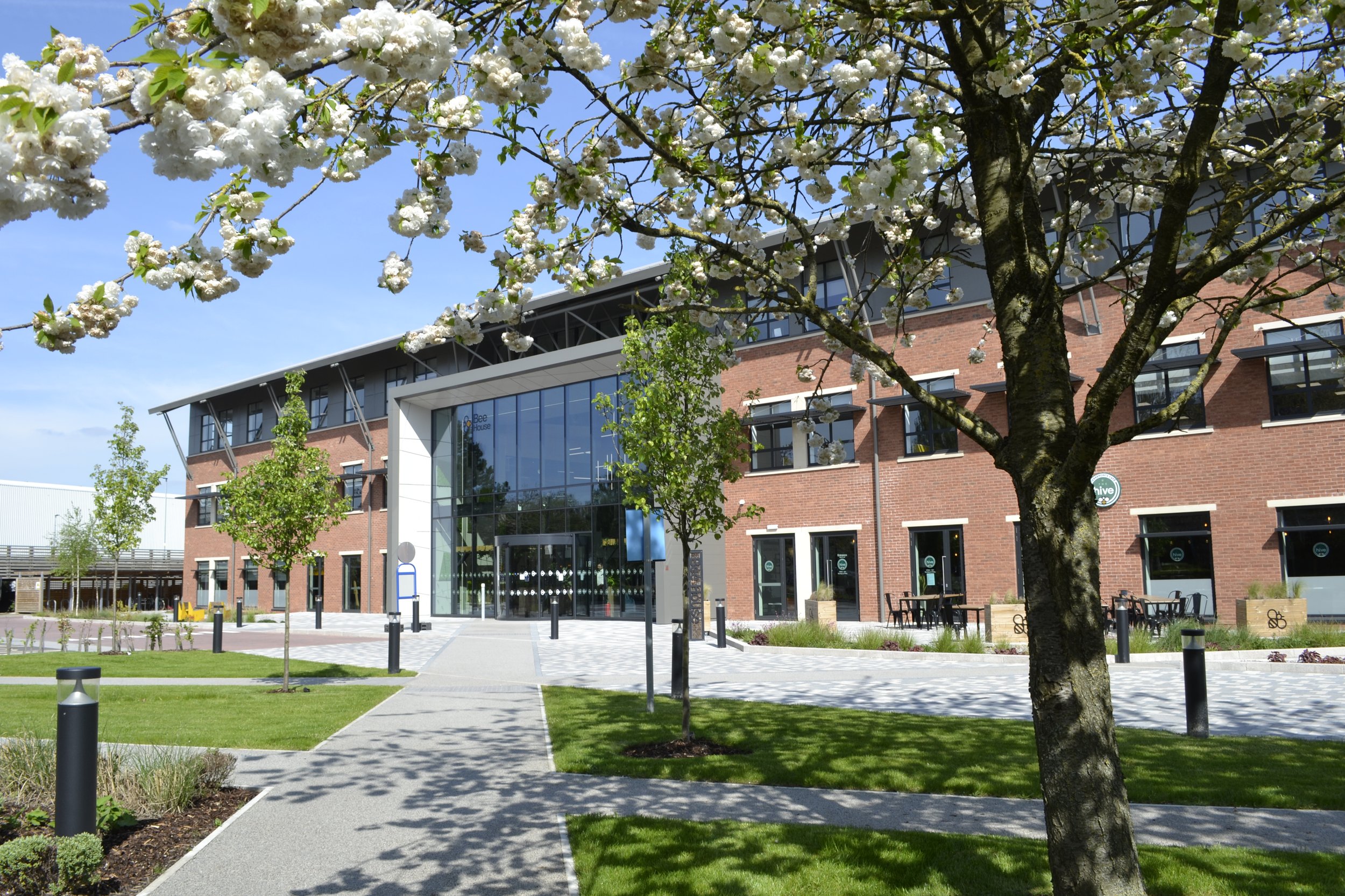
What I really love is approaching the entrance - with the feature lights, which are the same as the ones that hang in the lightwells, you can see them from across the street. It draws you in - which is what we wanted.
(Photos: Graham L Commons and Aurelien Langlais, courtesy of MEPC)
Which intervention do you think has been most successful?
NG: The lightwells.
SO: They definitely have the wow factor when you turn that corner – especially on the first floor and looking up.
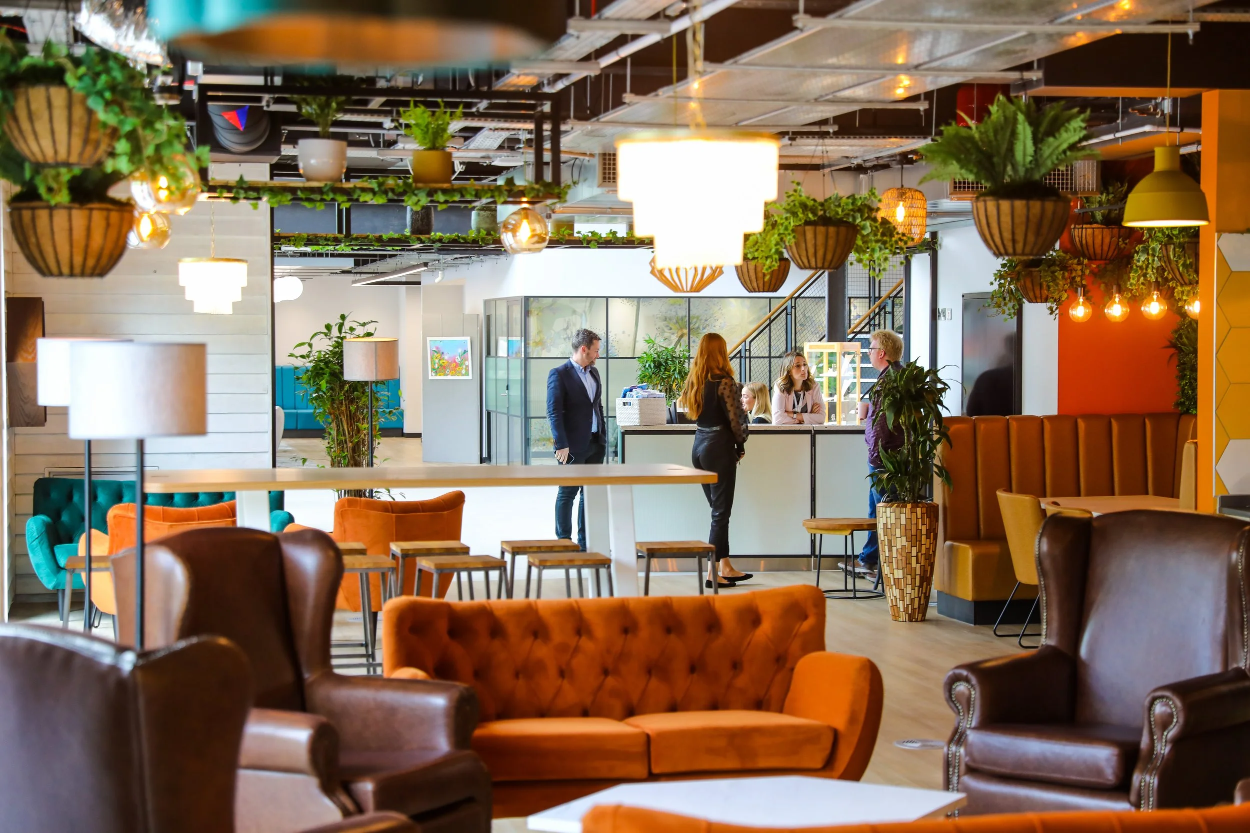
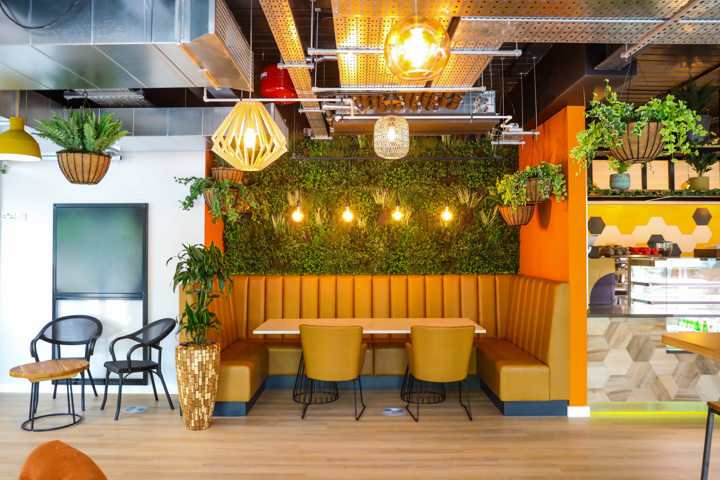
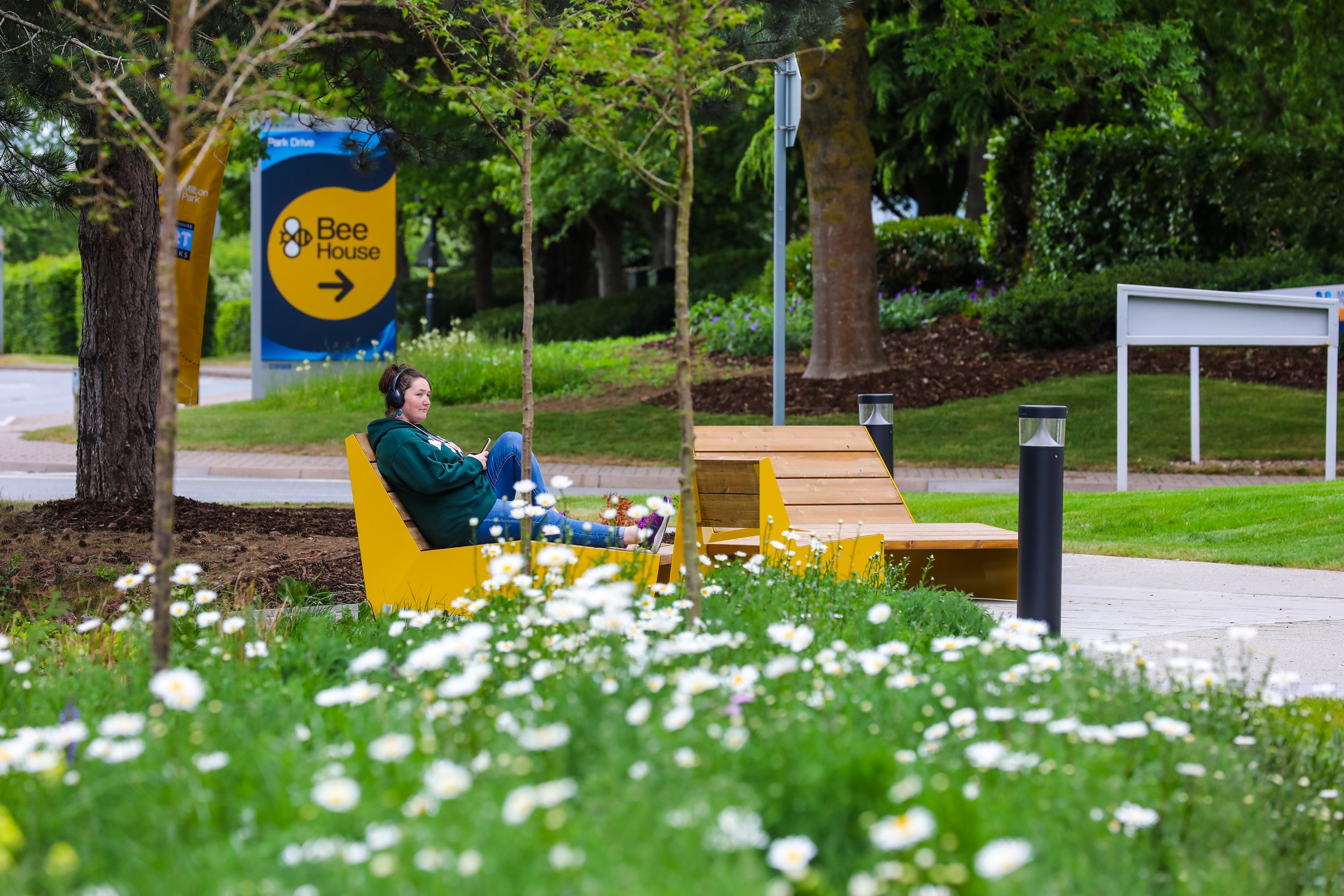
I think the combination of the café, atrium and business lounge has been really successful. Part of the brief was to make more of a campus feel. I think the conversion of the ground floor from parking, brought life and activity to the ground floor, the large café, the outdoor seating, the planting all contributes to making a successful hub. And now, with all the events you’re running, Nikki, there is a real sense of community here.
(Photos: Aurelien Langlais, courtesy of MEPC)
Do you have a favourite space to work in?
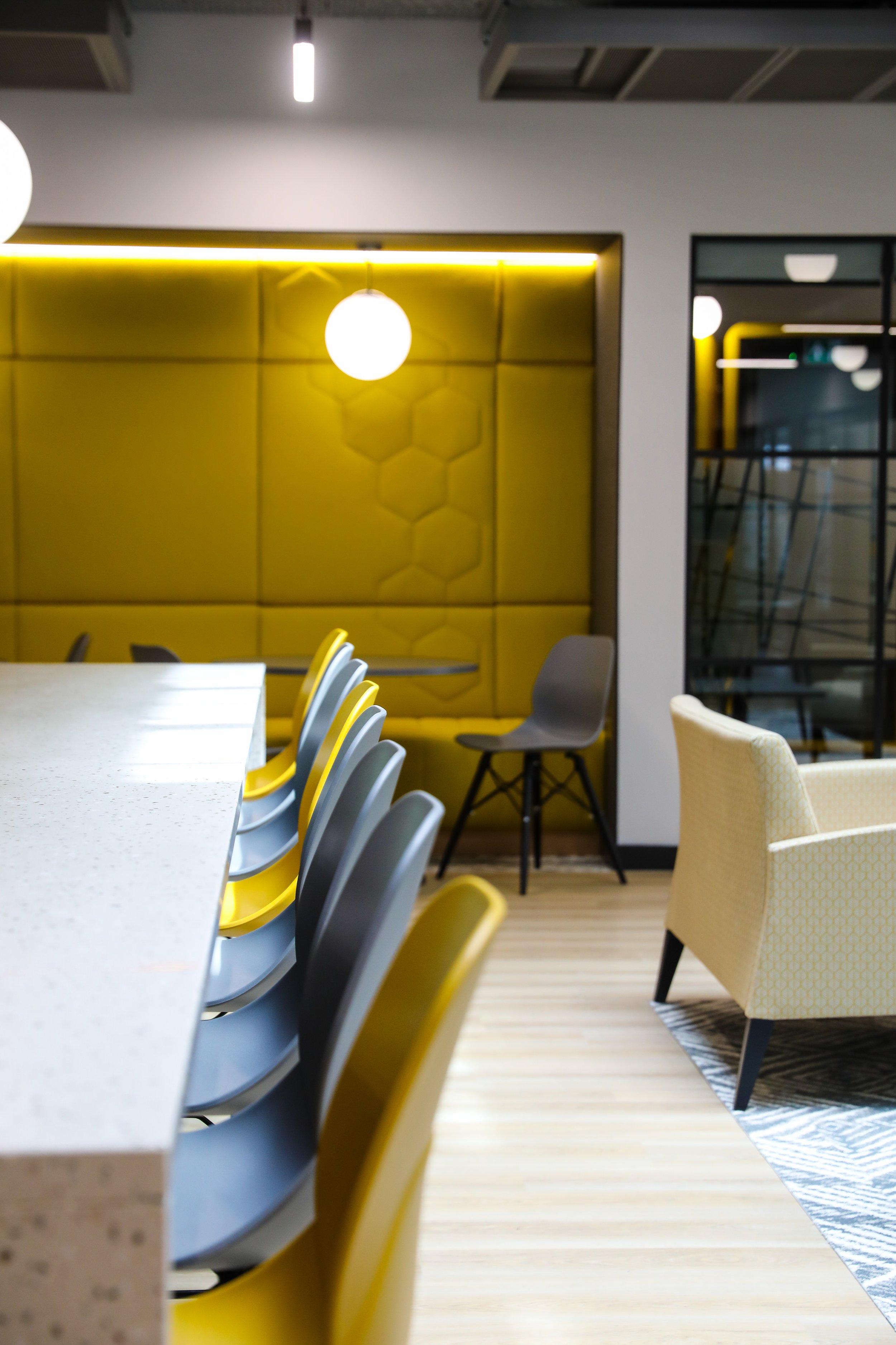
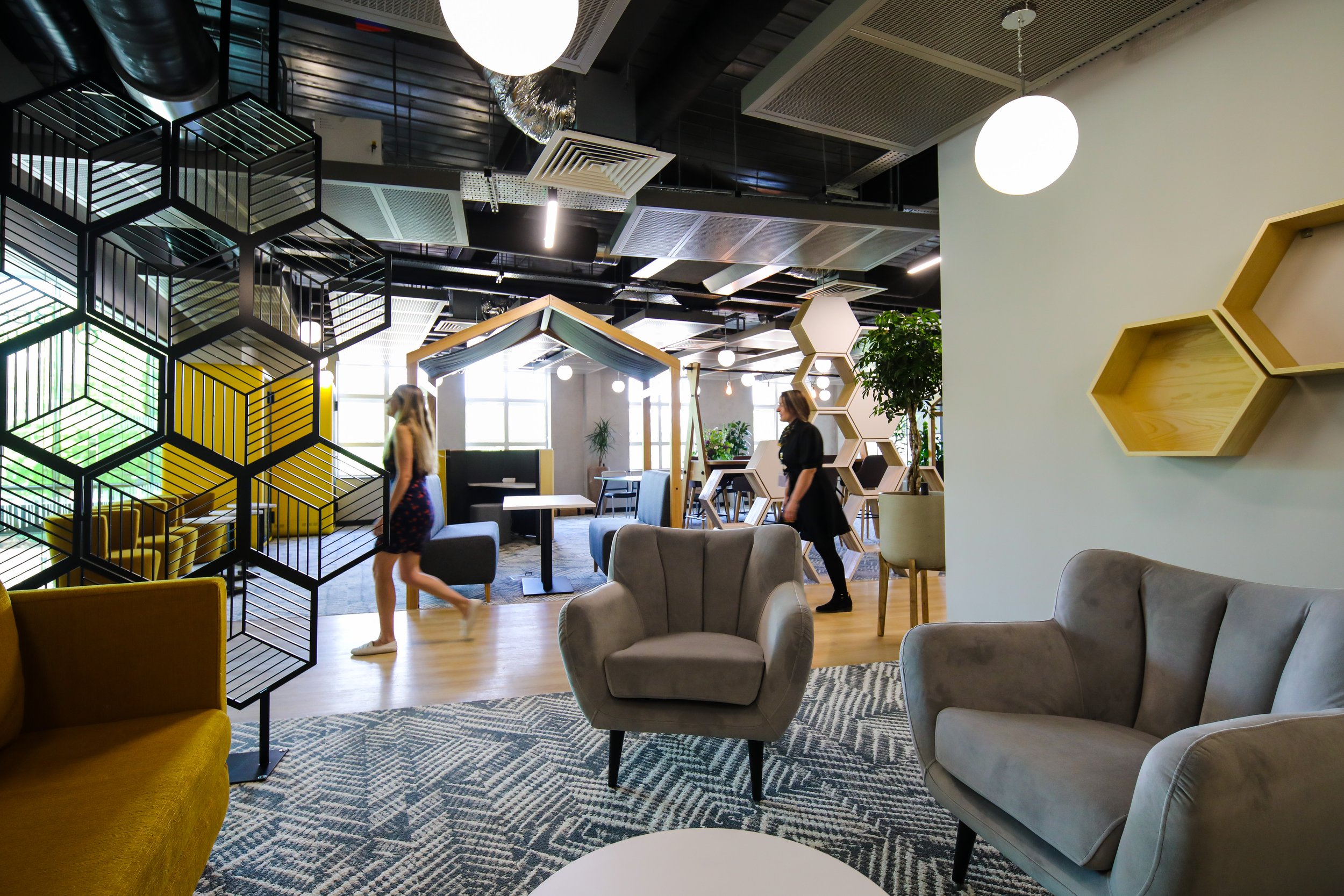
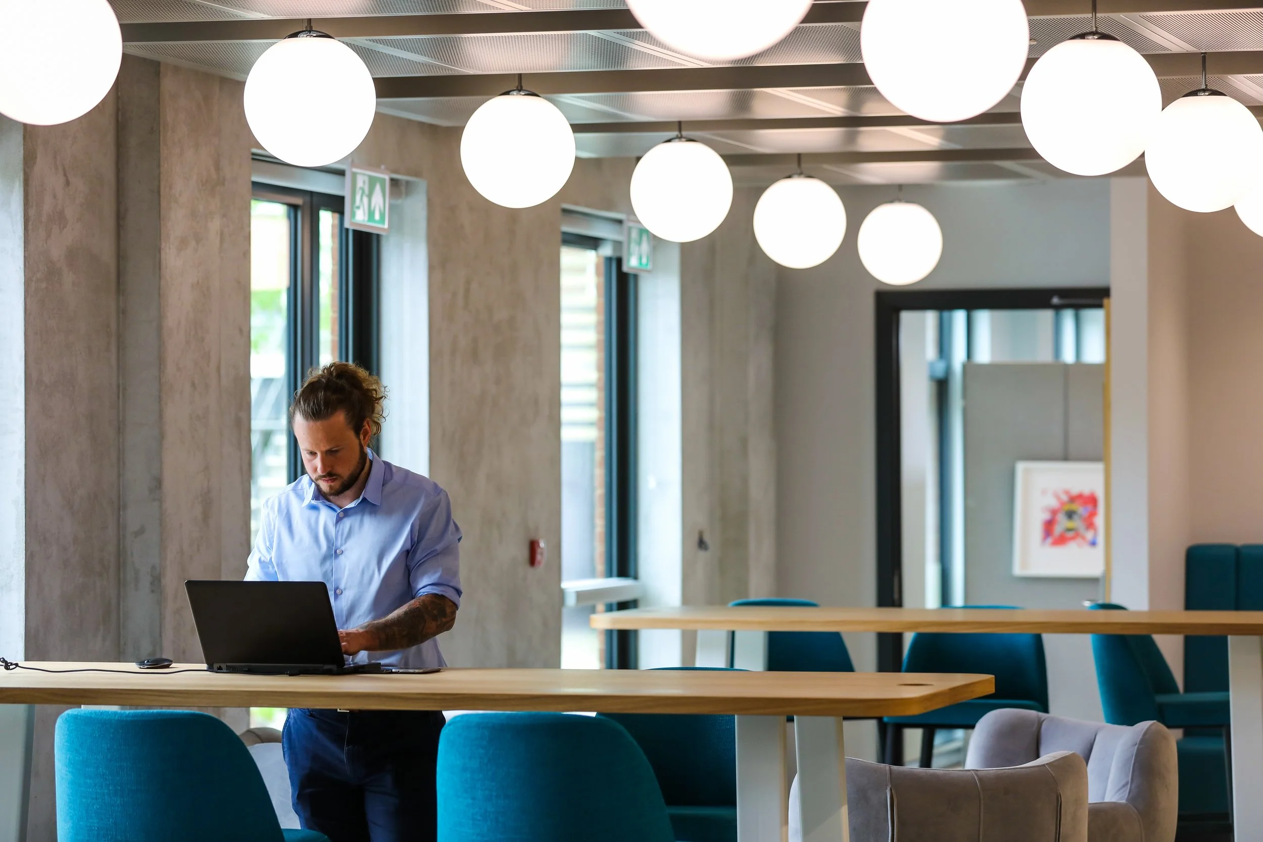
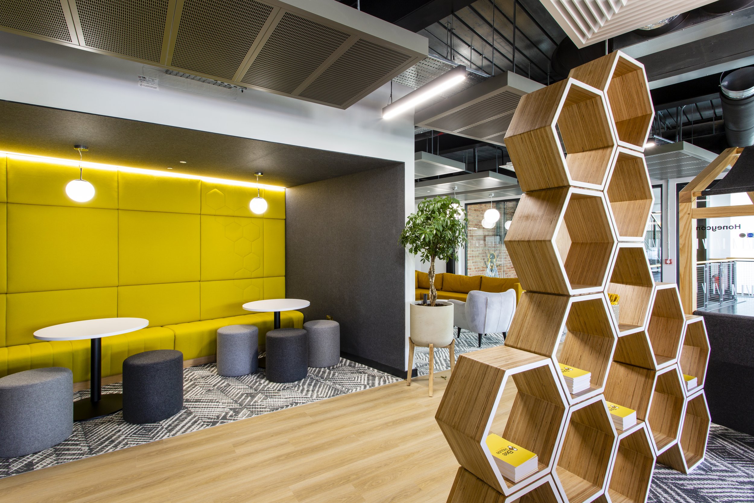
NG: I do love the Honeycomb co-working area. It's a nice temperature in there, it's cosy, there's everything you need. There are all different types of working areas, so I take myself up there and I feel like I get some concentrated work done.
SO: It was great seeing some people in there and using the different areas. We tried a few different seats – I think they have different advantages depending on what you need to do. Lots of different views – looking toward the atrium, or back towards the teapoint.
(Photos: Aurelien Langlais, courtesy of MEPC)
NG: Trying to cater to different people’s preferences and different ways of working is difficult. We tried to future proof that with that divide between the designated desk spaces and I'm so pleased that we did that because just being able to talk to people and say, you know we're building members right now, but when it gets busier, we have got the ability to say: “You're one of our noisier people, we're going to put you here” and “You're a bit quieter, you can go up in there”, and I think that for people thinking that they’re always going to be in this open space and be sharing with everybody, it’s quite nice for them to know, Ok, well, I’ve got options and I don't necessarily have to sit with that person.
How do you feel about the success of the amenity facilities? Are they popular and well used?
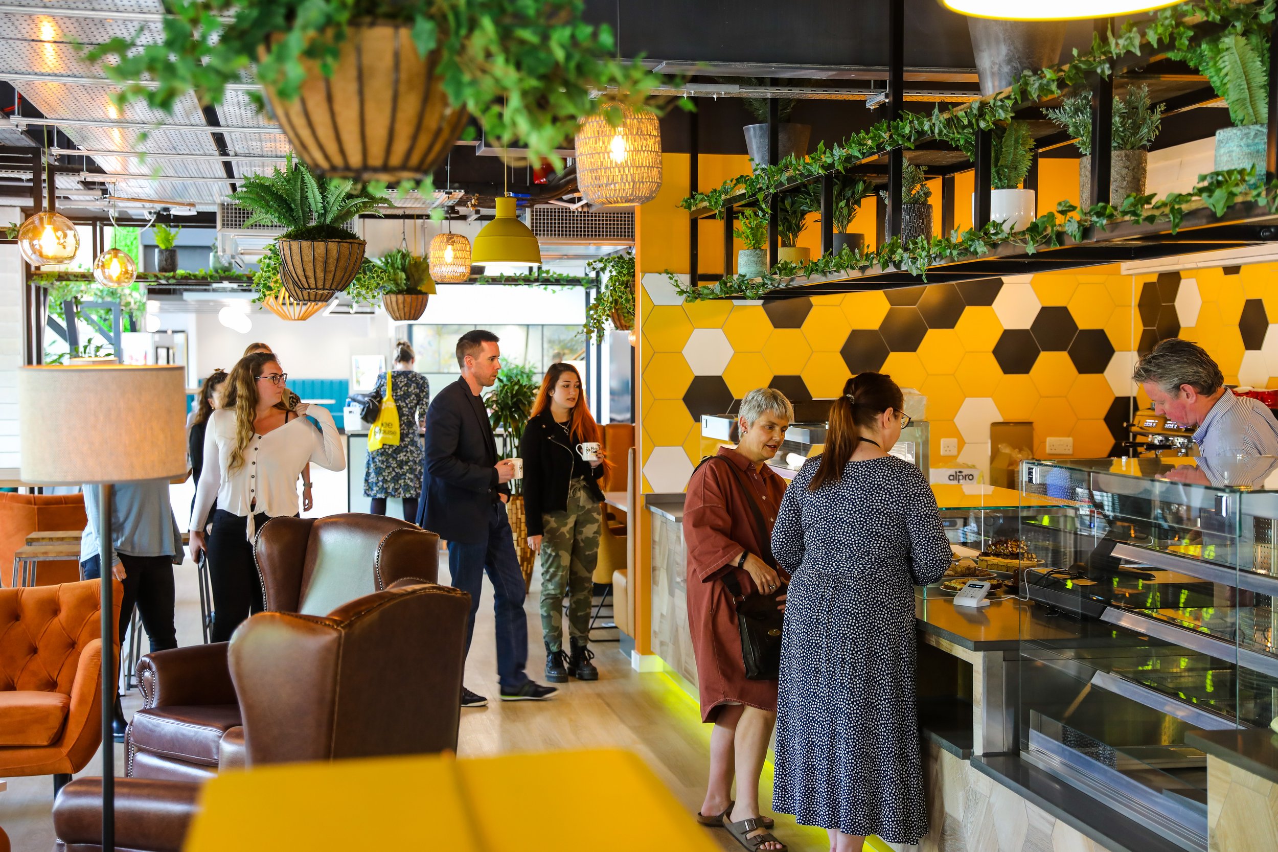
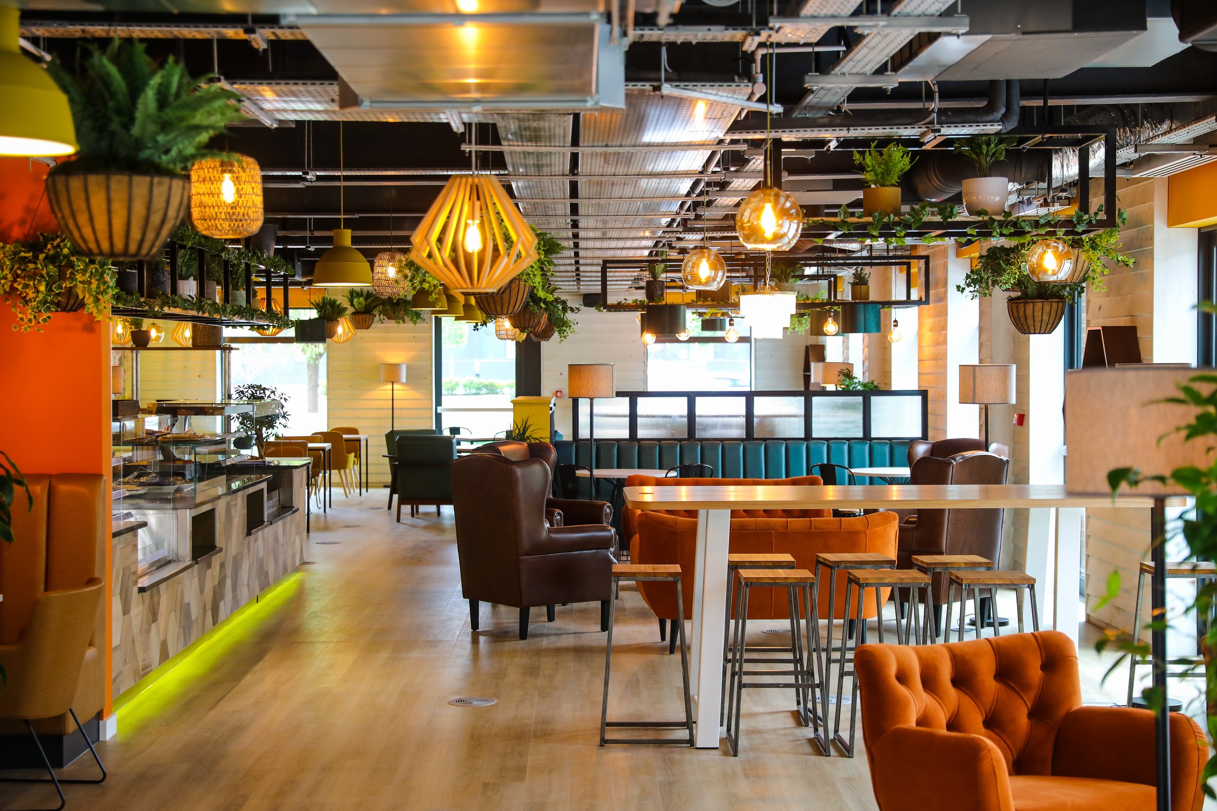
NG: The cafe has been a huge success. I think that the bold decision that MEPC took to just keep making it bigger and bigger was the right one.
SO: The café is brilliant – great coffee, cake and quiche! Originally the cafe was going to be about a third of the current size and on the other side of the atrium, and the business lounge was a lot smaller too. It would have packed a lot less punch.
(Photos: Aurelien Langlais, courtesy of MEPC)
NG: Yeah, it was a big move and one that paid off. The meeting rooms have been great. I would only say the meeting room within the coworking space doesn’t work quite so well. It evolved because I originally had that as more like a drop in clinic, was open [a] bit and it was accessible.
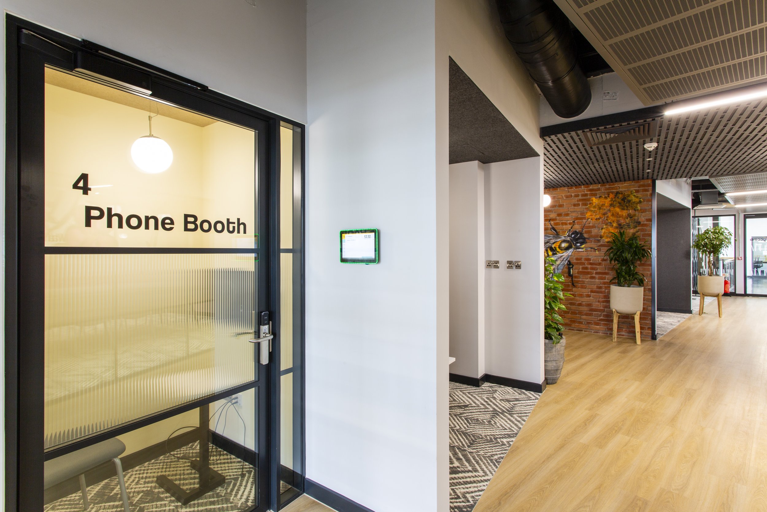
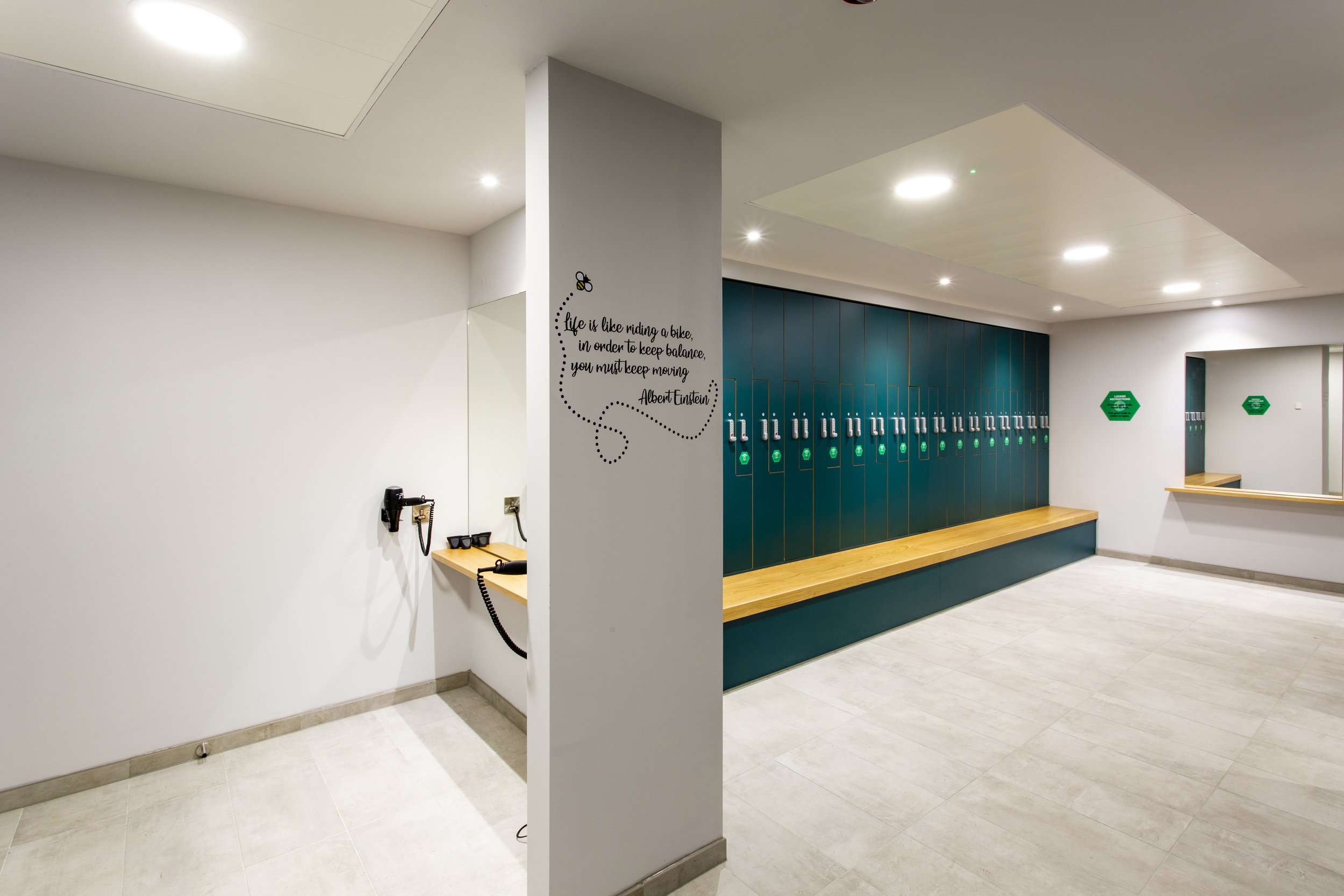
The phone booths get used, so they're great. The shower facilities and drying room, is great. And what I love, when I do viewings, a comment that people often say is ‘You've thought of everything’, that's good feedback.
(Photos: Graham L Commons)
Any moments that you really like about the building, or anything that you think improves user experience?
NG: I’d like to think that the unanticipated moment that might delight people that walk around the building for the first time are the light wells. I think they're unexpected as you walk around that corner and especially on the first floor you might look up and kind of see the lights or you know even if it's a dull day, inside there might be some little bit of sparkle in there.
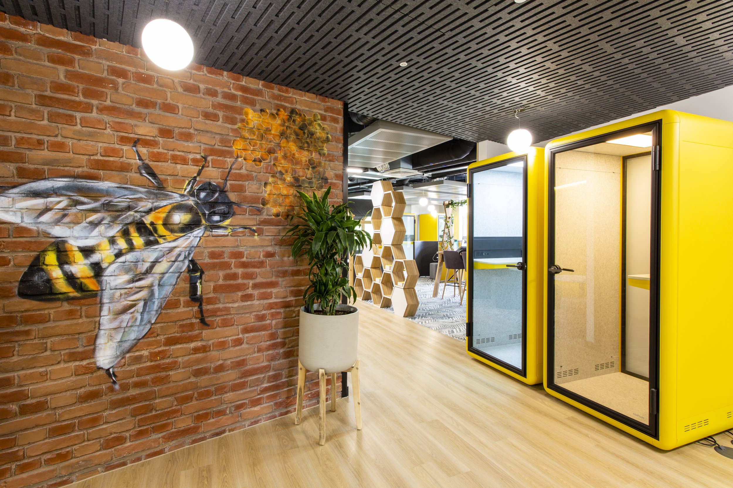
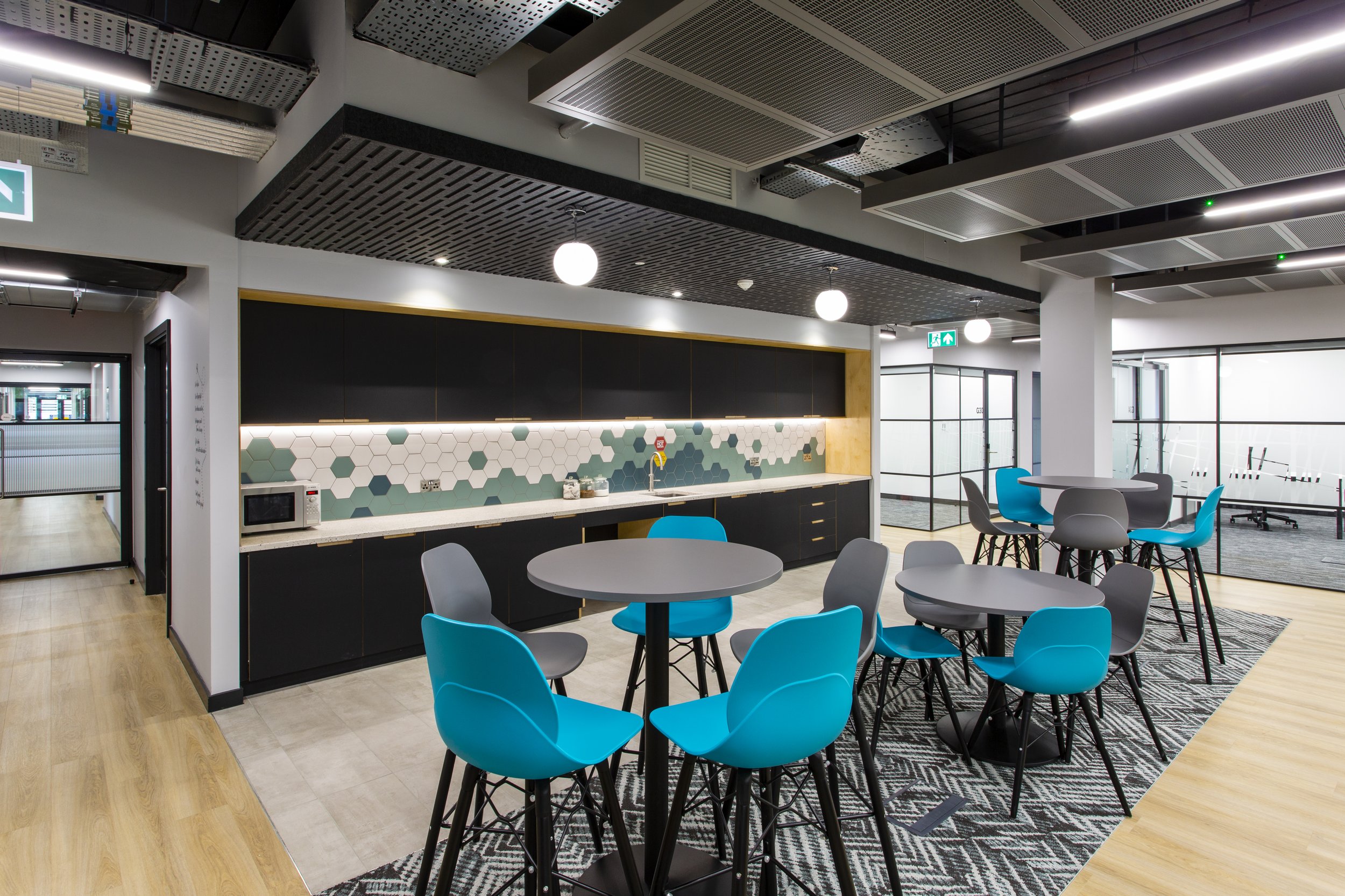
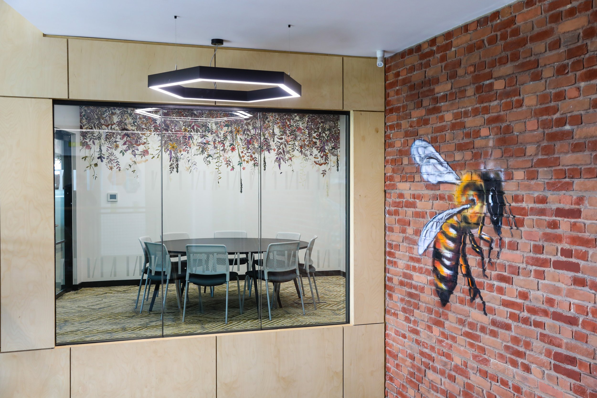
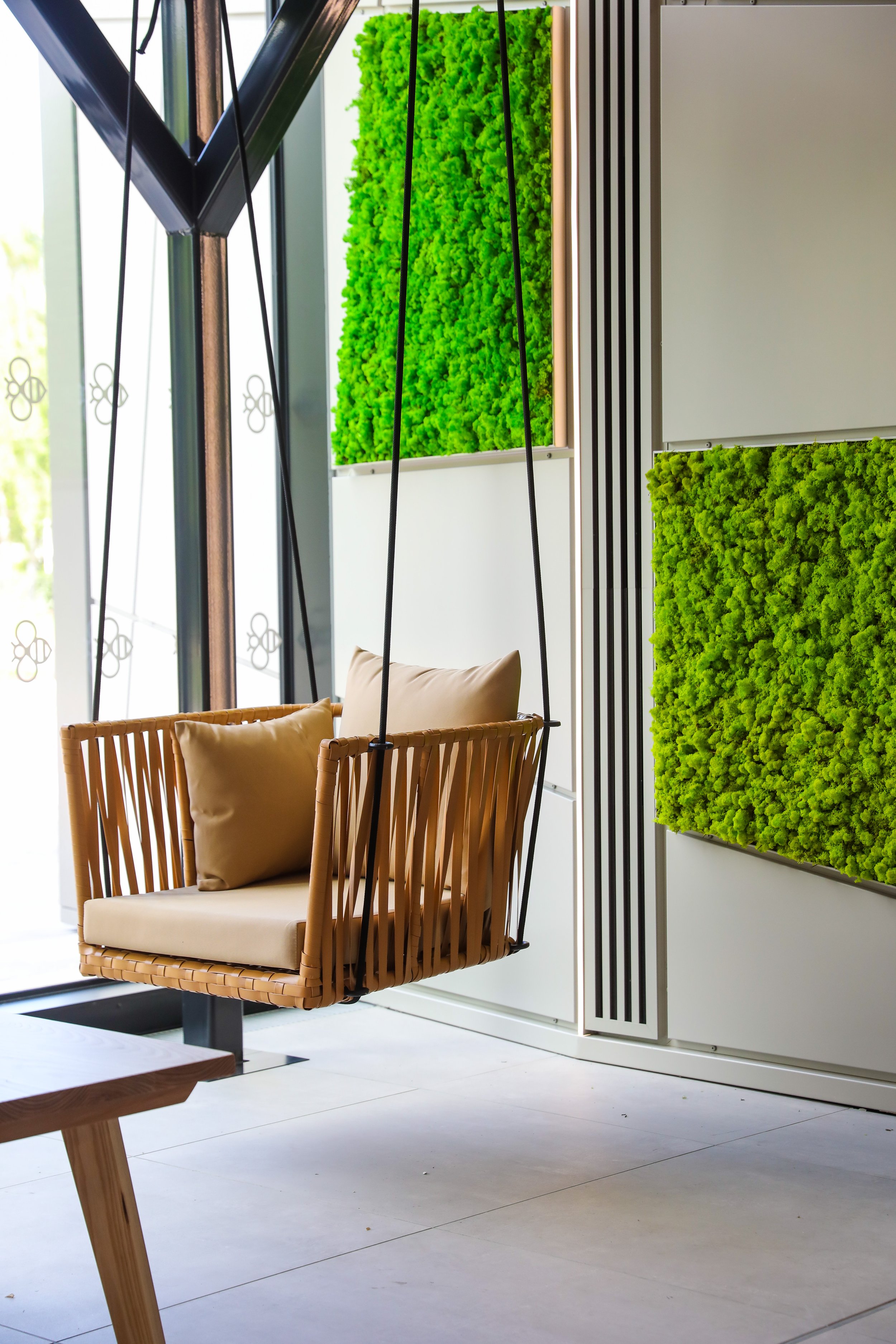
SO: Actually it was quite a versatile theme. The bee theme has given us a lot of mileage. Hexagon tiles, luminaires, the meeting room flower themes and then in the furniture, accessories, signage. Lot of nice little details for people to discover.
(Photos: Graham L Commons and Aurelien Langlais, courtesy of MEPC)
How successful do you think you were in creating the inspiring campus environment with enhanced landscaping aspired for in the brief?
SO: I think there was a moment which I kind of realised ‘ its worked!,’ … it was maybe just a week after opening. It was around lunchtime and there were people walking towards the café from a few directions. The café had just opened that week. People were gravitating towards it. It was brilliant to see and actually, I think that's continued since then.
NG: I think there's a lot of people that do now know it's here and clearly do use it and the cafe is doing incredibly well, better than I think any of us anticipated.
SO: I’ve seen people with babies, or elderly couples - it seems like it's not just people working in the area. Is it people coming in from Didcot or other towns?
NG: It absolutely is. And when we put stuff on social media, we get messages saying ‘Oh, it's now our new favourite place’.
(Photos: Aurelien Langlais, courtesy of MEPC)
The brief required improvements to levels of natural daylight, circulation and the core arrangement and the flexible provision of both Cat A and Cellular offices. Do you think that it's been successful?
SO: We developed the two designs side by side throughout Stage Two, which was either CAT A fit-out for one to six occupiers to do their own fit-out or a CAT B fit-out of serviced offices and co-working - which is what we ended up doing.
The core was designed to work with either option and so if working practices changed, it could easily be opened up for some huge offices that take up half the building if that's what was needed. And if a large business wants to come in and rent a range of offices together, there is the flexibility to do that. The services and the core and everything is designed to allow for that flexibility to go one way or the other.
NG: Even the smallest offices within the building that are positioned internally still feel light due to the glazed partitions allowing natural light to feed through, but also their position in and around the light wells giving some indirect light.
SO: I think the building itself was already set up quite well in terms of circulation. There was a natural route that kind of formed pretty much from where the stairs were. We haven't changed the stairs but what we did do was set out the core to get a better window to wall depth. That naturally formed the central services which is your dark spaces - toilets, risers, meeting rooms, storage with the shared spaces and light-wells at either end. The original building, as an open office, didn't work quite so well but, with the deep plan, it works really well for a more cellular arrangement and the circulation formed naturally. We were gifted that really.
(Photos: Aurelien Langlais, courtesy of MEPC)
We were asked to look at optimising the level of development on the site. So how did we do, any big moves?
SO: The car deck site could be an entire development on its own but then we would have to keep all the car parking around this building and under the building to then meet the parking numbers needed. Or you could fully fit out this building and minimise the car parking around this building to fully maximize its development with the car-deck there to service the parking requirements – which is what we did. And we explored various options in between.
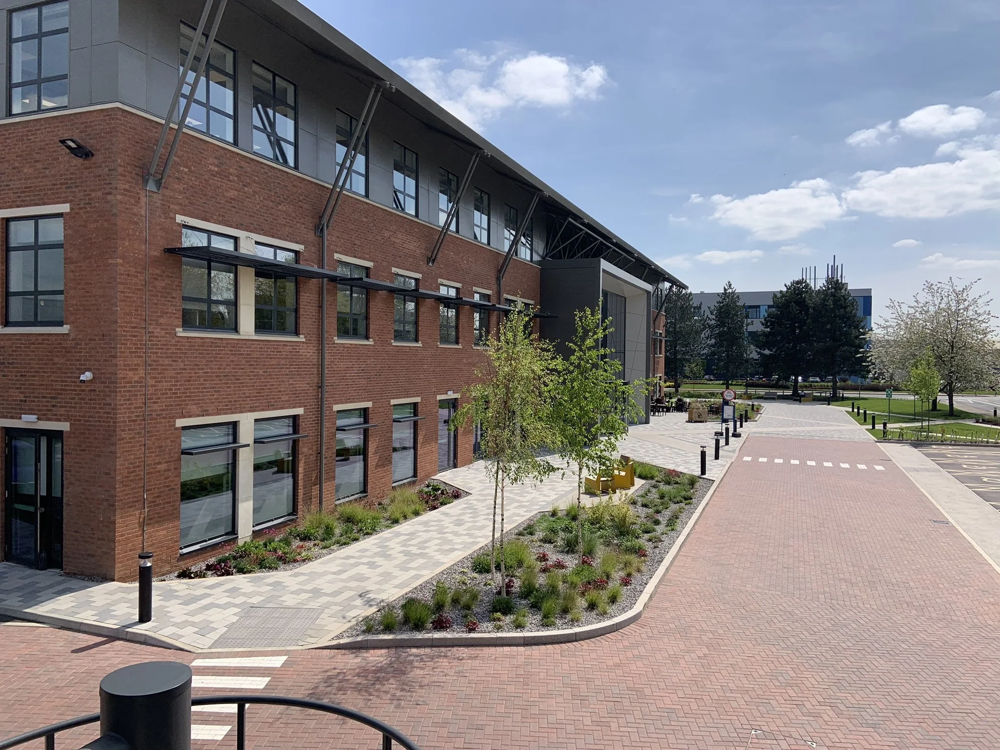
What we did gave this existing building the best chance of success. We’ve removed as much parking as possible from the southwest corner, which means that we can have seating areas, lots of lovely planting which helped to create that campus feeling that we were after. We also moved the vehicle entrance north, which meant that really there's very few cars that have to come around the front of the building. Deliveries are routed around to the back and I think it just means that it's much more pedestrian friendly and feels more natural.
That was kind of the big move in terms of the site itself and the development of the site. It felt less wasteful to use the building that we had already.
(Photos: Aurelien Langlais, courtesy of MEPC)
SRA were appointed by MEPC in 2019 after winning the Design Competition to reimagine 140 Eastern Avenue. Construction started in 2021 and the Bee House opened in May 2022 – just after World Bee Day!
Project Details:
GIA: 53,701 ft²/ 5,918m²
NLA: 37,585 ft2 / 3,492m2
Project Value: £12.4m
Awards:
WINNER / HIGHLY COMMENDED
OxpropFest Awards 2022 - Best Commercial Development
Thames Valley Property Awards 2023 - Workplace of the Future
Insider South East Property Awards, 2023 - Workplace Fit-out of the Year
SHORTLISTED
BC0 Awards South West 2023 – Refurbished / Recycled Workplace
Estates Gazette EG Awards 2023 – Best Workspace
Pro-Landscaper Awards 2023 – Commercial Design Project
Find out more about this award winning project here:
140 Eastern Avenue, Bee-coming the Bee House — SRA Architects (sra-architects.co.uk)
Valuable, Adaptable Workplace — SRA Architects (sra-architects.co.uk)
Delivery Team:
Client - MEPC
Brief Consultant / Building Operator - Ashdown Phillips
Architects - SRA Architects Ltd
Structural Engineers - Stantec
MEP Consultants - Qoda Consulting Ltd
Landscape Architects - Anthony Stiff Associates
Project Manager - Savills
Cost Consultant - Hadland Manning Bullock
Principal Designer - Hadland Manning Bullock
Approved Inspector - B&NES (LABC) / VOWH
Breeam - Mainer
Main Contractor - Barnwood
Café Fit-out/Furniture Contractor - Total Projects Ltd

